Module 2: Checkpoint 2—Site name
| Conformance: Mandatory |
Requirements
The site name must be located directly below the Queensland Government logo.
The site name must provide a link to the site homepage.
Benefits of conformance
- Increased consistency.
Risks of non-conformance
- The user experience is decreased as a user may not be able to instantly identify the site.
Implementation advice
Explanation
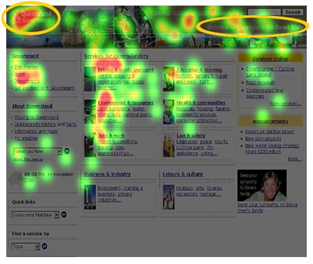
Usability testing conducted by Smart Service Queensland demonstrates that in the first 3 seconds of looking at a webpage, the user focuses on the top left corner of the screen.
In the following image, red indicates prolonged fixations whereas grey areas indicate an absence of fixation.

This image shows areas of fixation for the first three seconds of viewing a site. Using this timeframe shows the most visually compelling areas of the page that attracted users' attention prior to them actively processing the information presented.
It can be seen that the top left corner, where the Queensland Government logo is located, receives the most fixation, whereas the area on the right, where the site name is located, receives minimal fixation.
Screen resolution problems
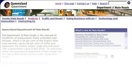
Having the site name on the right side was acceptable when websites were designed for small monitors with a screen resolution of 800 x 600, as there was not much distance between the Queensland Government logo and the site name.

Screen resolution: 800 x 600
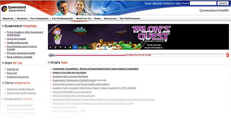
However, with larger monitors and increased screen resolutions (including widescreens on laptops), the distance between the Queensland Government logo and site name has increased dramatically. There is now a risk that the site name gets lost in the design.

Screen resolution: 1280 x 1024
International convention is to have site name in top left.
Usability experts recommend that the upper-left corner is usually the best placement for languages that read from left to right.