Module 1: Checkpoint 12—Text headings must not be displayed as images
| Conformance: Mandatory |
Requirements
Images must not be used in place of text headings (e.g. navigation headings, content headings).
Benefits of conformance
- Improved support for visitor customisation, including text resizing.
- Improved website performance.
- Search engine optimisation.
Risks of non-conformance
- Images used as text add unnecessary page weight and HTTP requests negatively impacting on web performance.
- Reduces user's ability to customise font styles, sizes, colours (for example: user stylesheets).
- In some older browsers, images do not resize when a user chooses to resize text on a webpage – if the text is made larger, the image will not be made larger.
Implementation advice
More information
Background images should be considered for decorating headings and navigation. Background images have the benefit of being able to be created from smaller repeating images and can be combined as sprites to limit additional HTTP requests per page. This approach maintains real text for the textual part of the heading/navigation so text-resizing is supported and allows visitors to customise font styles, sizes and colours.
Web pages that have large or a number of images take longer to load. People who have slower connections can set their browsers so that images are turned off. This increases the download speed of the web page. However, this can cause problems when images are used instead of text.
Search engines cannot read text inside images. Google advises that, 'If you want search engines to understand your content, keep it in regular HTML'. ( Google Webmaster Central )
Explanation
Using images instead of text for headings or navigation can cause significant accessibility problems, particularly for users with impaired vision (including many elderly people). This is because users cannot use the browser to increase the size of the navigation labels.
In addition to this, without an appropriate alternative (alt) text for each link label, the navigation may be inaccessible to users of screen reading technologies.
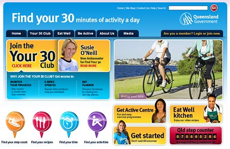
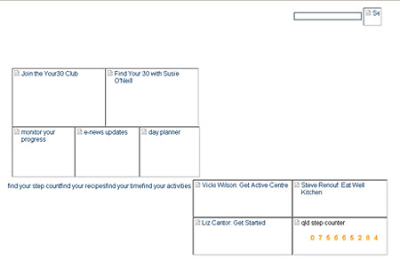
The following example demonstrates the problems with using images. The first screenshot shows the image. The second screenshot is what is displayed when images are turned off.
Example
With images are turned on – the links within the site navigation are visible and identifiable.

With images turned off – site navigation has disappeared. The user is unable to determine if any links exist.
