Develop Easy Read content
Easy Read is a clear and concise style of writing that conveys core messages using plain English. Visual aids (such as pictures, symbols, or diagrams) are also used to make content easier to understand.
Use this guide to develop your own Easy Read content.
Easy Read documents and websites are not only for people with a disability or marginalised customer groups. It explains the most important information in a short easy to follow format. Everyone likes to get information easily and without much effort, no matter how well they can read or write.
The Easy Read format can be applied to documents such as:
- healthcare materials
- customer fact sheets
- complex documents—legislation, policy, and strategies
- instructions to support high-use services.
Literacy has a big impact on people's lives. It affects how they communicate, learn, work, and deal with the government. When someone has low literacy skills, it can be difficult to get the help they need from the government or understand important information.
Literacy levels
According to the Programme for the International Assessment of Adult Competencies, Australia about 44% of Australian adults read at a year 10 literacy level or below and lack the literacy skills required in everyday life. Of these, 14% have very poor literacy skills and 30% have below-proficiency level literacy.
Factors that affect literacy include:
- age
- education
- where people live
- exposure to written words in adult life
- language ability and cultural background
- abilities and limitations—temporary, situational, or permanent cognitive, neurological, and social impairments
- how people access information—print, websites, television, apps, and signs.
Your agency may have their own approach and format for designing Easy Read documents, but key features should include:
- images to add meaning to text
- basic language and grammar
- minimal punctuation
- clear, large font
- simple layout and design
- white space
- bullet points to break up text.
There is a need for simple and direct information. Many customers struggle to process large amounts of information and understand what is required because of the complexity of words used.
What should be included:
- everyday language
- one idea per sentence
- simple and short sentences
- active, direct and inclusive language
- personal pronouns such as ‘you’ and ‘we’ for your department or organisation
- explanation of complex words
- bullet points to present information clearly and to break up text.
What shouldn’t be included:
- paragraphs of information
- plurals unless necessary
- homonyms—words that have multiple meanings such as ‘hard’ or ‘fine’
- abbreviations such as 'e.g.'
- contractions such as 'don’t’
- acronyms—only use acronyms once they have been expanded the first time and the acronym is continued to be used multiple times and with regular use.
- jargon, clichés and technical terms
- stand-alone pronouns such as ‘it’ or ‘that’
- complex words—if necessary, then include a simple explanation with the word.
- tables or graphs
- italics or underlining to emphasise important information
- blue and underlined website links.
Examples
Don’t write this way
The Department will send a new card in the mail. All enquiries can be made to the Department via phone or written correspondence. You can also visit us in person at a Customer Service Centre.
Write this way
You will get a new card from us in the mail.
If you do not get your new card you can:
- call us [number]
- write to us [address]
- go to a Customer Service Centre.
For customers to understand and validate their interpretation of images, they need to clearly demonstrate what action is being performed, followed by words.
What to include:
- colour for both images and vector icons
- positive facial expressions of people
- hands or bodies when text includes actions
- little to no background in image
- positive imagery
- cultural and diverse imagery
- graphic icons in place of a deceased person in material for Aboriginal and Torres Strait Islander communities.
What customers told us (Easy Read pilot)
- Customers thought images were missing when too few or small images were used on a page.
- Images that portray negative experiences had adverse effects on the customer and should be avoided.
Examples
Demonstrate speed limits
Don't use this image:

Use this image:

Demonstrate a customer service officer
Don't use this image:

Use this image:

For documents such as Word and PowerPoint, consistency in layout and colour throughout is important to customers. Different design styles can disrupt their flow of reading and comprehension.
Layout:
- centred Easy Read logo and Queensland Government Coat of Arms on the title page
- two to four images on one page
- consistent placement of images and textboxes throughout the document
- consistent purpose or application and placement of title colour blocks to introduce new topics—this makes it easier to scan and find
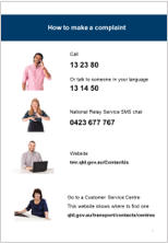
- website links and phone numbers in ‘Contact us’ page only.
Colour:
- corporate colour for the cover page border and section headings
- soft colour block behind complex word explanations and important information
- Indigenous artwork in the document for communications to Aboriginal communities.
Text:
- centred alignment for titles
- left alignment for body text
- Arial font:
- 21 point font size for headings, bolded
- 16 point font size for body text
- 24 point font size for contact numbers, bolded
- font colour:
- black for all titles and body
- white for title colour blocks
- black and bolded website links (not underlined).
What customers told us (Easy Read pilot)
- Colour blocking grabbed the customers attentionand made text easier to see.
- Customers requested evenly spaced dot points
Format examples


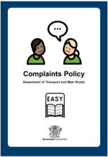
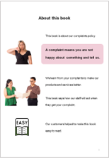
This guide was developed as part of the Department of Transport and Main Roads Easy Read pilot. It tested and co-designed an Easy Read version of the Complaints Management Policy with consultants from Queenslanders with Disability Network.
Easy Read examples:
- Easy to Read Complaints Policy, Queensland Government (Department of Transport and Main Roads)
- Child Restraints Guide, Queensland Government (Department of transport and Main Roads) (PDF, 878 KB)
- Easy Read resources for people with intellectual disability, Australian Government (Department of Health and Aged Care)
Easy Read guidance from other states:
- Easy Read, South Australia Government Online Accessibility Toolkit
- Easy Read, Australian Government Style Manual
Email designandcapability@chde.qld.gov.au for feedback and questions.